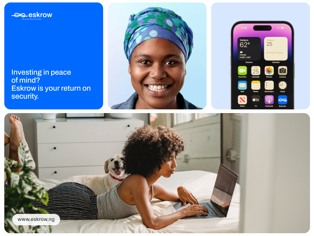
Eskrow
Eskrow set out to solve one of the internet’s most pressing challenges: trust in online transactions. As a platform that holds funds in escrow until both parties fulfill their obligations, Eskrow needed more than just a logo — it needed a brand that embodied security, neutrality, and reliability. That’s where Webify came in.
Year
2024
Scope of work
Brand Identity, Messaging, Visual Strategy
Our Approach
We partnered with the Eskrow team to craft a brand identity that visually and emotionally communicates “safe, trusted middle ground.” From tone to typography, every element was created to reinforce confidence and calm in an industry often riddled with anxiety.
Key Branding Elements Delivered
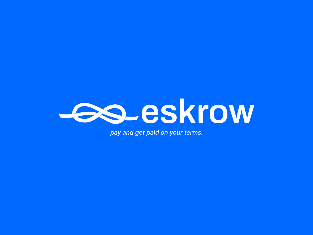
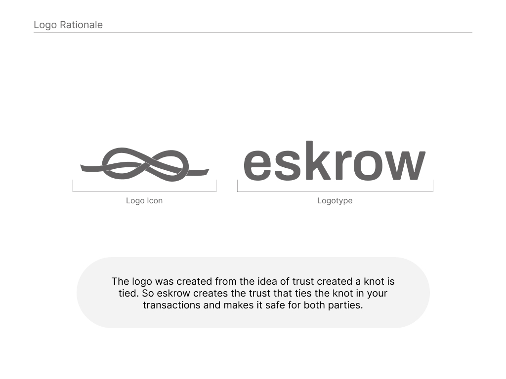
Logo Design
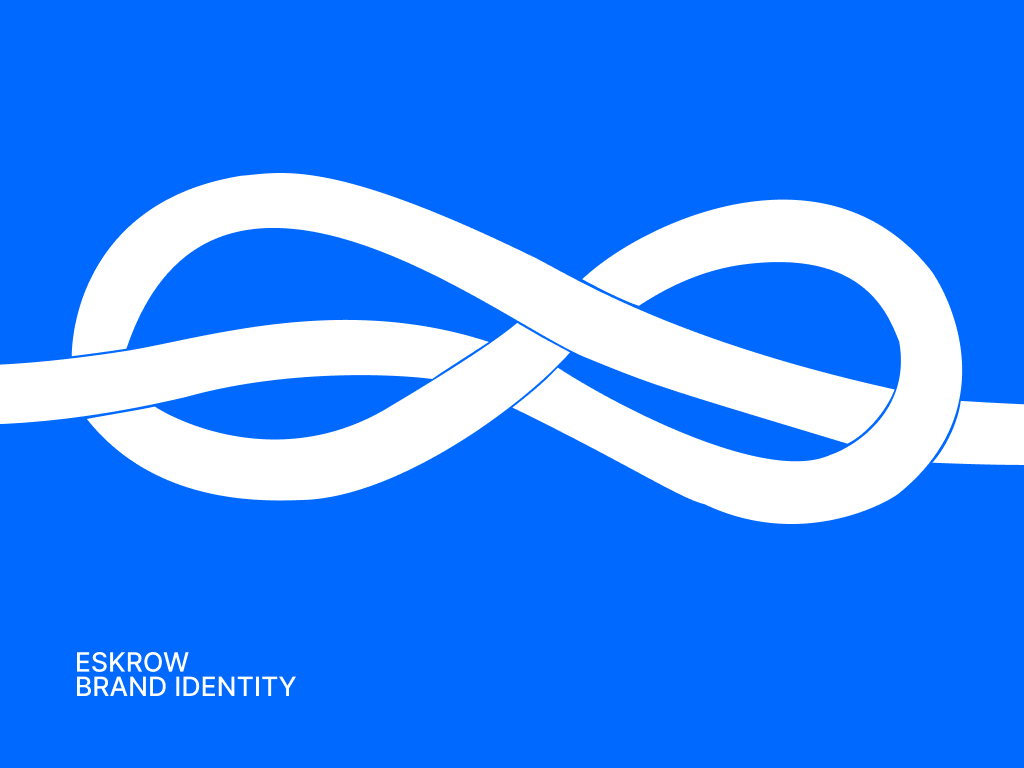
A bold, modern emblem that evokes a handshake across a divide — a symbol of trust, balance, and connection.
Brand Messaging
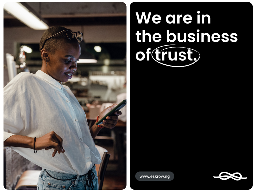
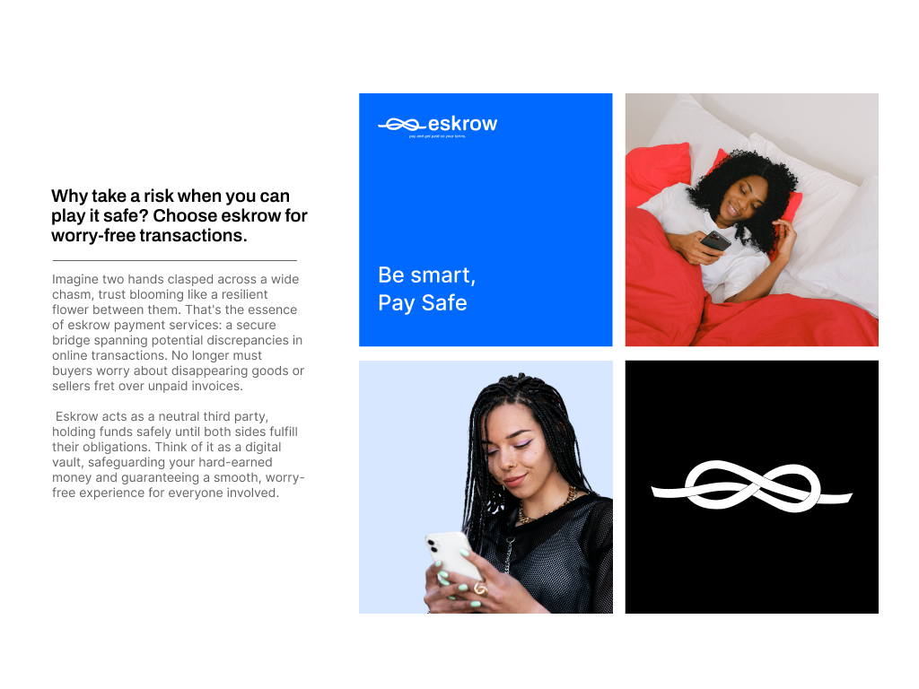
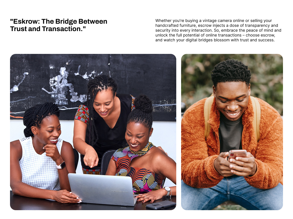
We helped shape Eskrow’s tone of voice around metaphors of bridges, vaults, and handshakes — making the complex nature of escrow services feel approachable and reassuring.
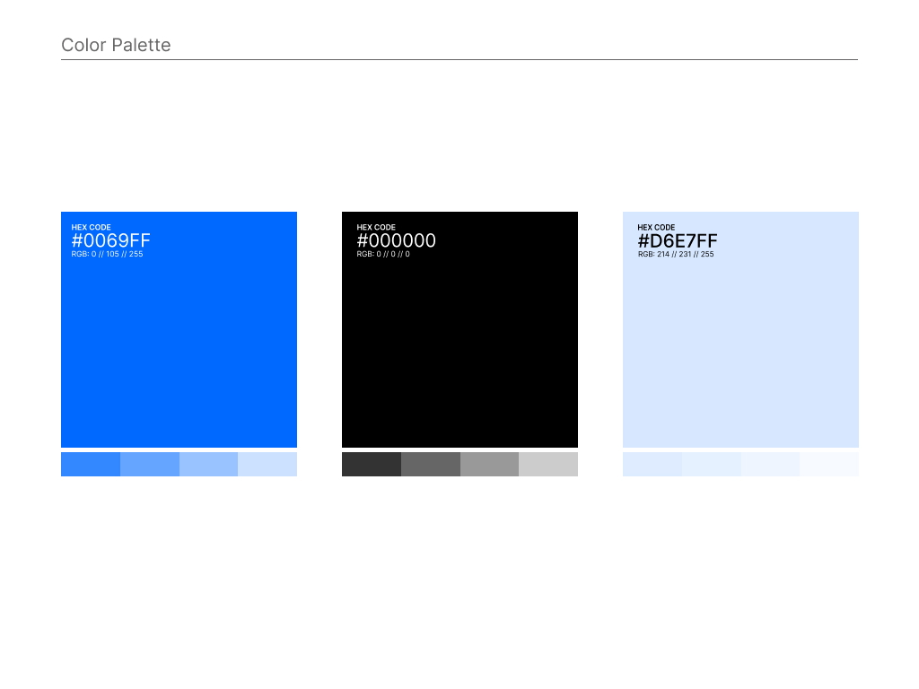
Color & Typography System
A sophisticated palette that blends tech-forward blue tones with warm accents, paired with modern, legible typography for digital-first applications.
Visual Concept Direction
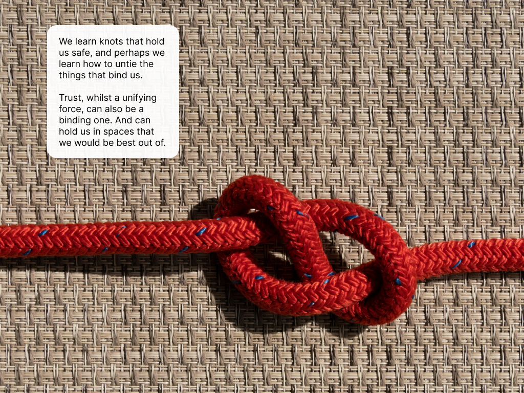
We conceptualized Eskrow’s core visual story: “Two hands clasped across a wide chasm, trust blooming like a resilient flower between them.” This guided imagery, iconography, and digital mockups.
